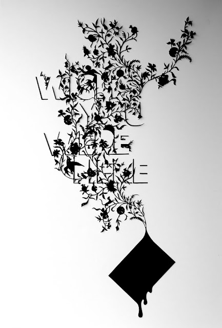
On his blog (http://wordsarepictures.wordpress.com/) he describes himself quite modestly, and again minimally as: "...a London based designer and illustrator who likes playing with words." which is succinct and apt.
Only yesterday I was looking for examples of bad typography - and gave up because it's so prevalent and I didn't want to upset anyone, but I did come across his work and thought I'd post it to encourage a little bit of typographic variety in the world.


